TanStack Form Registry
Start BuildingInstallation
pnpm dlx shadcn@canary add https://tancn.dev/r/react/tanstack-form.jsonAdd the tanstack-form component to your project using the shadcn CLI.
Usage
This tanstack-form registry component provides a comprehensive set of hooks and components for building forms with TanStack Form. It includes form validation, field management, and UI components.
Here's a basic example of how to use it:
Example Usage
import { draftFormSchema } from './schema'
import { useAppForm } from "@/components/ui/tanstack-form"
import { revalidateLogic } from "@tanstack/react-form"
import { toast } from "sonner"
import * as z from "zod"
import { FieldDescription , FieldLegend} from "@/components/ui/field"
import { Input } from "@/components/ui/input"

export function DraftForm() {
  const draftForm = useAppForm({
    defaultValues: {
      email: ""
    } as z.input < typeof draftFormSchema > ,
    validationLogic: revalidateLogic(),
    validators: {
      onDynamic: draftFormSchema,
      onDynamicAsyncDebounceMs: 300
    },
    onSubmit: ({ value }) => {
      toast.success("success");
    },
  });
  return (
  <div>
    <draftForm.AppForm>
      <draftForm.Form>
          <h1 className="text-3xl font-bold">Waitlist</h1>
 <FieldDescription>"Join our waitlist to get early access"</FieldDescription>;
 <draftForm.AppField name={"email"}>
                {(field) => (
                    <field.FieldSet className="w-full">
                      <field.Field>
                        <field.FieldLabel htmlFor={"email"}>Your Email *</field.FieldLabel>
                        <Input
                          name={"email"}
                          placeholder="Enter your Email"
                          type="email"

                          value={(field.state.value as string | undefined) ?? ""}
                          onBlur={field.handleBlur}
                          onChange={(e) => field.handleChange(e.target.value)}
                          aria-invalid={!!field.state.meta.errors.length && field.state.meta.isTouched}
                        />
                      </field.Field>

                      <field.FieldError />
                    </field.FieldSet>
                  )}
              </draftForm.AppField>

          <div className="flex justify-end items-center w-full pt-3">
          <draftForm.SubmitButton label="Submit" />
        </div>
      </draftForm.Form>
    </draftForm.AppForm>
  </div>
  )}
Anatomy
The tanstack-form has Super Cool Form Composition Feature that allow Breaking Large and Complex Form into Composable Field, The Registry Uses Form Composition + ShadCN Field Components to Allow Ultimate Flexibiity
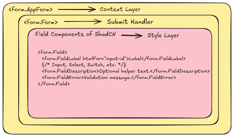
- AppForm: The main form instance created with useAppForm, providing form state and methods.
- Form: The root form element that handles submission and provides form context.
- AppField: A field component that integrates with the form instance for validation and state management.
- FieldSet: Groups related form fields together.
- Field: Wraps individual form fields with validation, error handling, and accessibility attributes.
- FieldLabel: Provides accessible labels for form fields.
- FieldError: Displays validation errors for the field.
- FieldDescription: Provides additional descriptive text for form fields.
- FieldLegend: Provides legends for fieldsets.
- SubmitButton: A button component that submits the form and shows loading state during submission.
- InputGroup, InputGroupInput, InputGroupAddon: Components for grouping inputs with addons.